Citizen Portal – Accessibility Improvements (3.79)

Description

The Citizen Portal accessibility has been updated to improve usability.

For example:

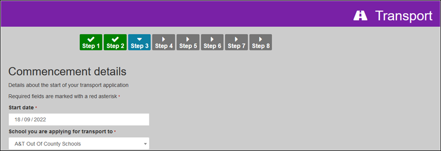
Mandatory fields display an asterisk

Click image to enlarge. Use browser back button to return.

Click image to enlarge. Use browser back button to return.

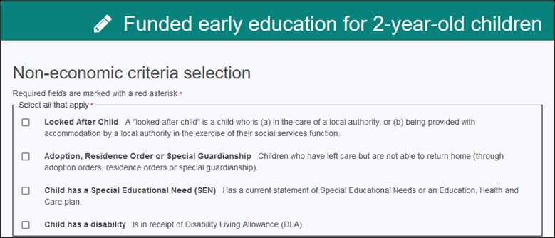
TYOF Non Economic criteria selection: All the required fields for the non economic criteria selection are grouped together and an asterisk is added after Select all that apply.

Click image to enlarge. Use browser back button to return.


Pages linked from Site footer

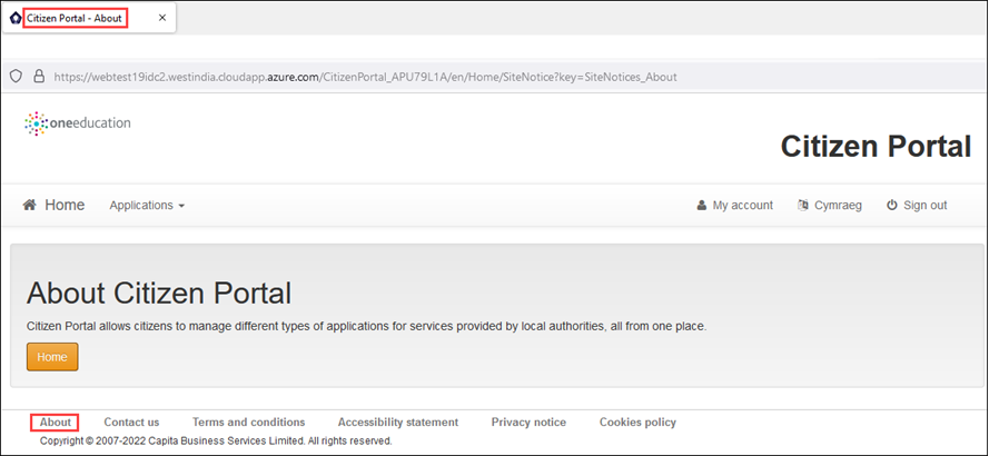
Previously, all of the pages linked from the footer used the title Citizen Portal – Site notice. They now display the correct title.

Click image to enlarge. Use browser back button to return.

How would you rate the information provided on this page?

If it's not 5 stars please provide feedback to help us improve it

Average rating 0 / 5. Vote count: 0

No votes so far! Be the first to rate this post.

Please provide feedback on this post to help improve it

Tell us how we can improve this post?