Citizen Portal – The My Account menu has been improved for mobile users (3.73)
Description
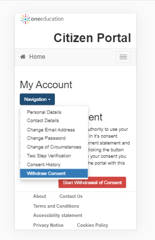
Users on mobile phones are no longer be presented with the side by side browser display when accessing the My Account menu. Navigation is now by drop-down list with the selected option as shown below.

Click image to enlarge. Use browser back button to return.